Saturday
Stories Behind 7 Famous Beer Logos
The next time you open a bottle of beer, don't just chug the brew - take a look at the logo on the label. Ever wonder who St. Pauli Girl actually is? Or why there's the mysterious number "33" on Rolling Rock beer bottles? Read on. Neatorama takes a look at the Stories Behind 7 Famous Beer Logos:
St. Pauli Girl: Probably Not Just a Waitress

What's not to like about the St. Pauli Girl? She's blonde, big bosomed, and brings us big frothy mugs of beer! But what most people don't realize is that she's not exactly just a waitress. Yep, St. Pauli is the famous red light district of Hamburg, Germany.
In 1977, St. Pauli Girl Beer started to choose a spokesmodel to represent the beer brand and appear on the popular St. Pauli Girl poster. In 1999, they started using Playboy magazine playmates as the girl (the 2008 St. Pauli Girl is Irina Voronina). Here's the gallery of St. Pauli Girls from 1977 to 2007:
Pabst Blue Ribbon
This one's pretty straightforward. PBR was originally named Best Select, then Pabst Select and finally Pabst Blue Ribbon, named because the practice of tying blue ribbons around the beer bottleneck from 1882 until 1916.

Rolling Rock 33

The mysterious '33' has been on the label of Rolling Rock since the Latrobe Brewing Company brewed its first batch in 1939, but what does it actually stand for? Theories about the origin of the cryptic '33', some undoubtedly hatched in bar arguments, range from the year 1933 (the year Prohibition was repealed), how many steps it took to walk from the brewmaster's office to the brewing floor, the number of the racing horse on the label, and even the highest level of Freemasonry (33rd degree).
According to James Tito, the former CEO of Latrobe Brewing, the number '33' may actually be an accident. When the founders of the company came up with the slogan Rolling Rock - From the glass lined tanks of Old Latrobe, we tender this premium beer for your enjoyment as a tribute to your good taste. It comes from the mountain springs to you.someone wrote '33' at the end to indicate the number of words, but the bottle printer mistakenly incorporated it into the label graphic. They decided to keep the 33 instead of having to scrap and replace the bottles. Even though the slogan had been changed several times in the history of Rolling Rock, the company had made sure to use the same number of words.
Heineken: the Friendly 'e'

Guinness: Harp of Brian Boru

Arthur Guinness brewed his first stout in 1759, it took Guinness over 100 years later to select its logo - the harp of Brian Boru - a gaelic harp in Ireland's heraldic emblem and a symbol of Irish unity, not to mention the Euro coin. By the way, Ireland is the only country in the world with a musical instrument as a national emblem.
Brian Boru was the king of Ireland that ruled from 1002 to 1014 and protected and/or freed - depending on who you ask - the Irish people from the Vikings. The harp named after him, however, was actually much, much older. According to Celtic myth, the gaelic harp was owned by the Dagda, a king/god/father-figure, that can summon the seasons.
There's actually a real instrument named the harp of Brian Boru. It's one of three surviving medieval harps dating from the 14th or 15th century and is on display at Trinity College Dublin.
By the way, if you are named O'Brien or O'Brian, then you're a descendant of King Brian Boru - so a toast (Guinness, of course) is in order!
Stella Artois: the Horn
Stella Artois was launched as a Christmas beer in 1926 - its name is a combination of the latin word for "star" and Sebastian Artois, a brewmaster in the Den Hoorn Brewery (founded 1366) in Louvain, Belgium.

The logo of Stella Artois beer reflects the beer's origin - Den Hoorn is Dutch for "The Horn," and the now-defunct brewery lives on as the horn prominently displayed on the top of the label of every bottle of Stella Artois beer. The fancy frame around the name is also in the style of Flemish architecture in the city.
Bass Red Triangle

(L) Bass & Co's Pale Ale, the very first trademark registered in the UK (1876) at the Intellectual Property Office; (R) current logo
Bass Pale Ale's Red Triangle logo may be simple, but it's pretty darned special: it's the very first trademark registered in Britain. When trademark registration law took effect on January 1, 1876, a Bass employee was sent to wait overnight outside the registrar's office in order to be the first in line to register a trademark the next morning. Bass & Co. Brewery got the first two trademarks, the first being the Bass Red Triangle for their pale ale and the second the Bass Red Diamond for their strong ale.
Bass is also the most frequently featured beer in fine arts. Bottles of Bass beer can be seen in Manet's 1882 painting Bar at the Folies-Bergère.

Bar in den Folies-Bergère by Edouard Manet (1882)
Bonus: Old Milwaukee's Swedish Bikini Team
Okay, so this isn't exactly about beer logos - but brewers often advertise their beers in outrageous manners, and there's nothing quite as outrageous as the notorious Old Milwaukee's Swedish Bikini Team:

Labels: Arts, Beer, Interesting, Lego
# posted by Dany @ 5:46 AM

Sunday
Soccer Posters of 32 national teams for World Cup 2010

To honor the biggest sport event of the year, ESPN TV collaborated with top-tier New York ad agency Wieden + Kennedy to give birth to 32 original soccer posters, one for each participating country at World Cup 2010 hosted in South Africa. Every poster symbolizes football and national tradition of the country.
These posters can be seen on such places as print ads, billboards, bus shelters, hand-painted murals on buildings, food trucks, a print insert, 3’x4’ art gallery pieces, art books, digital banners and rich media banners.
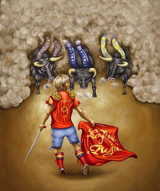
Spain

South Africa

Slovenia

Nigeria & South Korea

Paraguay & New Zealand

Uruguay

Slovakia & Argentina

Portugal & Brazil

Mexico

Italy

Germany

Japan & Honduras

Ghana & Cameroon

France

England & Holland

Denmark

Serbia & Greece

Australia

Côte d’Ivoire & Chile

Algeria & North Korea
Labels: Arts, Funny, Interesting, Sports
# posted by Dany @ 10:07 PM
Saturday
Design the magic bus in world
Amethyst The Magic Bus by Samonberry
Samonberry is the creator of the Amethyst the Magic Bus who learned his craft at the Old-world school of Gypsy Painters. His art is very true to the original psychedelic art of the 60's and has managed to do a great job of capturing that era. His art includes posters, stickers, fine art, clothing along with this amazing 72 VW bus called Amethyst. I saw Samonberry at my first Art Car Fest in 2005 and was also featured in a video in which he describes how his art car came about.


Magic Bus, Byron Bay by Andrea Davies
Its a been a long time since I made a blog entry here on ACC, busy working on web design projects and getting under the hood of my Mercedes Pens Art Car for some much needed engine work.
But its great to get back into the game with this amazing Magic Bus, Byron Bay, the world's most colorful double-decker bus that is is now in service. This bus was painted by Andrea Davies also creator of the "wallpaper" Golf featured a while back here on ACC.


Argentine Bus Protester Gets Graffiti Makeover
I found this before and after shot of a camper van on the Plaza delos Dos Congresos parked near the Argentine National Congress as a form of protest by the owner about something or rather. Some months later the bus gets a fantastic makeover by a young French artist named Louis D’Anjou a.k.a 'GROLOU, who thought the bus needed a facelift. I think the new look is a vast improvement,nice work.
I found this before and after shot of a camper van on the Plaza delos Dos Congresos parked near the Argentine National Congress as a form of protest by the owner about something or rather. Some months later the bus gets a fantastic makeover by a young French artist named Louis D’Anjou a.k.a 'GROLOU, who thought the bus needed a facelift. I think the new look is a vast improvement,nice work.

Knitted Bus from Mexico
The Knitted bus from Mexico is covered because they get cold at night.
The Knitted bus from Mexico is covered because they get cold at night.

This Side That Side Art Bus
I just got this in tonight and thought it would be a great addition to ACC. Its a 1990 GMC 3300 17 passenger school bus located in Capitan, NM (near Ruidoso). Its owned by Linda & Kurt Howard, owners of Horsemen's Grill & Cabins in Capitan, NM and was painted by This Side That Side, J. Atlasand and completed in only 20 days, December 2009.
I just got this in tonight and thought it would be a great addition to ACC. Its a 1990 GMC 3300 17 passenger school bus located in Capitan, NM (near Ruidoso). Its owned by Linda & Kurt Howard, owners of Horsemen's Grill & Cabins in Capitan, NM and was painted by This Side That Side, J. Atlasand and completed in only 20 days, December 2009.


Labels: Arts, Cool, Interesting
# posted by Dany @ 1:34 AM
Thursday
Best Tattoo Collection Ever


Subscribe to Posts [Atom]